


Data visualization has quickly become a normal way for businesses to tell how current operations are going and test the effectiveness of new marketing strategies online. In this article, we will explain the benefits of using data visualization for online business marketing, as well as provide some insights of some of the best data visualization tools available on the market today.
What is data visualization?
Data visualization deals directly with the graphic representation of data. Data visualization is often used as a method of communicating different points of data over a specific period of time. In the business world, data visualization is used in a number of different ways such as to identify trends and opportunities or track growth over time.
Data visualization is the process of taking raw data from a particular business or industry and transforming it into a graphic representation that can easily be understood by most individuals. The overall goal of the data visualization is to provide insights that can help an individual make better decisions for their business.
Data visualization can be particularly useful in today’s world for the purpose of online digital marketing. Many businesses today use data analytics tools to track different aspects of their current website such as traffic rate, conversion rate, and number of pageviews, for example, as a way to determine the effectiveness of a website’s visual presentation, content organization, and brand communication.
Why is data visualization important?
Data visualization can serve as a powerful tool for business decision makers, as it provides immediate insights on different aspects that can help in improving lead generation, optimize conversions, and generate more revenue online. Decision makers now have the ability to interact with data in real time, allowing them to take advantage of new opportunities at a much quicker rate than ever before.
Data visualization is also important because it:
- Allows for easier interpretation of business data
- Allows business owners to discover areas of business opportunity, or correct any errors quickly that might be hurting their business
- Allows for an overall visual representation of large data points to identify trends and patterns as a way to develop short and long term business goals
What are the benefits of data visualization?
Data visualization provides many different benefits to business owners such as:
- Ability to easily identify data patterns and trends
- Allows groups to fix any errors that could be hurting business growth
- Allows businesses to act quickly on new opportunities based on identified data trends
- Helps a business identify target audience, online engagement, lead generation, and new sales opportunities
- Allows for businesses to make more informative business decisions
8 Best Data Visualization Tools
1. Tableau
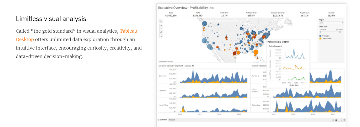
Developed in 2003, Tableau is a powerful analytics platform that makes it easy for businesses to explore and manage data as well as discover new opportunities and insights. Tableau is used by many different professionals including business owners, executives, analysts, students and more.
Tableau was built on a powerful technology known as VizQL, which provides drag and drop options for data point visualization. The purpose of the platform is to allow individuals to make more informative business decisions through the use of data as a way to improve their organization. The platform was designed with user experience in mind through an easy-to-use interface that allows individuals to easily interact and interpret data.
Tableau can easily be integrated with existing business technology to help visually connect all data collection methods into one cohesive space. Administration on Tableau is simple and straightforward, even for those that are not technologically savvy. All data on Tableau is also easily shareable, allowing teams to communicate with new data effectively when developing new business decisions.
Pros:
- Easy to use interface
- Integrates with existing technologies such as Google Analytics, Salesforce, etc
- All data collected is sharable among team members
- Great user experience
Cons:
- Paid version is somewhat expensive ($70/month)
- Lack of online support
- Some reporting of security and data embedment issues
- Data analysis is publicly available if you do not use the paid version of the platform
2. Datawrapper
Datawrapper is a data visualization tool that allows flexibility in data presentation methods as charts, maps and tables. Datawrapper is free to set up and relatively easy to begin. Datawrapper is a chosen data visualization tool used by a variety of business types, ranging from everything such as financial providers, media teams, and government organizations.

When using Datawrapper you can have your data converted into the following:
Charts – Datawrapper’s charts are responsive, customizable, and provide live updates to discover new trends and opportunities in real time. Datawrapper offers 20 different styles of charts, ranging from bar charts, line charts, pie charts, scatter graphs, and more.
Tables – Datawrapper also offers the ability to create a variety of different data tables through flexible styling options.Tables can be customized based on importance of specific columns through sorting, and highlighting features can help focus your attention on columns of importance. Heatmap technology also showcases particular data trends or outliers.
Maps – Datawrapper allows users to also create customizable maps that can be updated in real time. Choose from over 2000 map options that can be further customized through color or symbol visualization for different data points. Need help creating a data map? Datawrapper also offers an online academy and support to help get you started on the platform.
Pros:
- Choose from a variety of data visualization options through charts, tables and maps
- All data visualization tools can be further customized to highlight specific trends or areas of interest
- Datawrapper is free to start and create an online profile
- Online support and an academy helps users learn all features of the platform
Cons:
- Data visualization methods can be limiting for use by larger organizations
- Paid plans can run upwards of $599/month
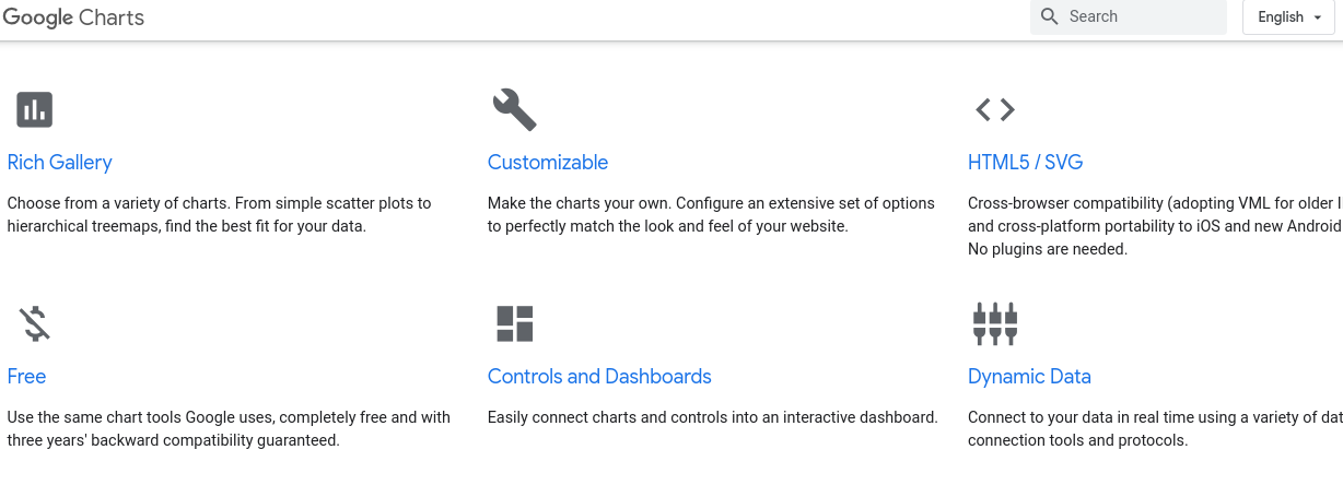
If you are relatively new to data visualization, Google Charts is a simple and easy-to-use tool available. Google Charts is available for use on most browsers, and allows for data integrations from commonly used business technologies for data sourcing such as Salesforce, Google Spreadsheets, Google Analytics and more. All data can be integrated into Google Charts in real time.
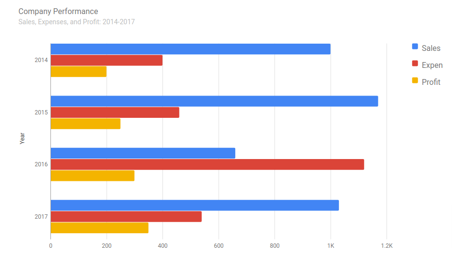
Google Charts can be easily integrated into a website design, and offers a variety of different customizable options (through use of CSS editing) for data visualization to best match a brand’s look and feel including the following:
- Maps
- Charts- column and bar charts, pie charts, scatter charts
- Timelines
Pros:
- Is free and easy to learn how to use
- Integrates with commonly used data collection technology
- Allows for real time data customization
- Offers different styles of data visualization through maps, charts and timelines
- Charts can be uploaded into a current website design
- Works across all browsers
Cons:
- Features can be somewhat limiting- not a huge selection of data customization tools
- Online support is somewhat limited
- Requires a network connection to use

FusionCharts is a comprehensive data visualization tool for Javascript developers that offers a variety of customizable options and features. FusionCharts is known as a trusted source for data charting and currently used by over 800,000 developers and 28,000 different companies today.

FusionCharts provides users with over 100 interactive chart options and over 2,000 data driven maps. These include the following options:
Charts – Choose from popular chart options such as column, pie, and line charts or select from more advanced options such as spider charts, heatmaps, waterfall charts, and more.
Maps – All maps can be customized by country, city, and location
Many people opt to use FusionCharts due to its user-friendly experience and various options for data customization. From start to finish, most new users of FusionCharts should be able to create their first chart in approximately 15 minutes or less. The application provides many pre-selected chart options with consistent theme styles so businesses can create a professional chart in just a matter of minutes.
Pros:
- Trusted application used by many Javascript developers
- Many customizable options to change the look and style for charts and maps
- Relatively easy to begin your first chart
Cons:
- Cost is expensive (around $500 for one license)
- Technical issues cost extra to address
- Some reports of issues with out-of-date software and debugging required
5. Looker

Looker is a powerful data visualization tool designed with business owners in mind. Data from Looker can help businesses drive new decision making strategies, develop new opportunities to provide value, generate revenue, and have one comprehensive space to keep all data products and workflows.

Looker offers a number of tools for business intelligence, embedded analytics and data modeling. These tools can allow businesses to profile different customers based on advanced analytics reporting features to develop new marketing strategies online.
The capabilities of Looker include the following:
- Analytics reporting – Looker provides modern analytics and tracking and reporting features through better analysis and BI reporting. This allows teams to have better access to reliable data for business decision making.
- Integrated insights – Looker can easily be integrated with other analytics reporting technologies to provide team members with unified insights on data trends and opportunities.
- Data workflows – All data using Looker can be segmented into different workflows for interpretation by various team members
- Custom applications – Looker offers the ability to customize data segmentation and visualization in a way that best suits a business’s needs
Pros:
- Allows businesses to interpret data for better decision making and discovering new opportunities
- Various systems allow businesses to develop various data workflows within the application
- Better analytics reporting with advanced reporting features provides businesses with in depth analysis
- Business intelligence software allows businesses to profile customers to develop marketing strategies
Cons:
- Pricing not available online – must request a quote
- Importation of large data volumes can be somewhat slow
- Requires adopting a new programming language (LookML)
- Development of new code can be time consuming
6. Qlik Sense
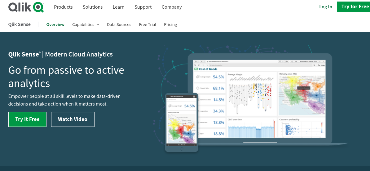
Qlik Sense is a data visualization platform developed to help businesses better interpret analytic data for more informed business decision making. Qlik offers comprehensive data visualization dashboards and real time data reporting features, giving businesses the ability to make more intelligent business choices.
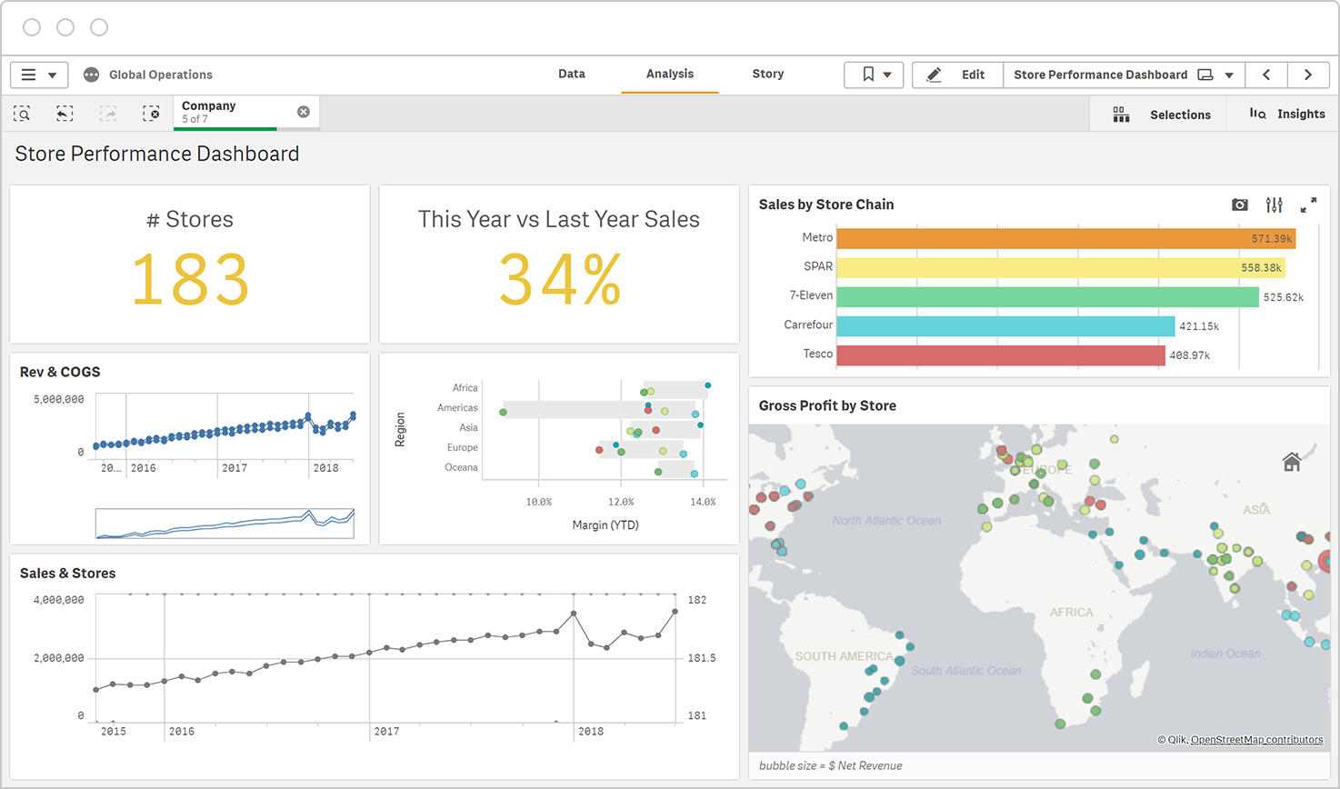
Reports on Qlik are quick and easy to create, can be managed entirely through the platform, and easily shared among colleagues to determine workflows and actionable opportunities. The platform offers embedded analytics, allowing it to integrate seamlessly with an existing data collection platform to provide real time reporting, as well as the ability to create custom dashboards.
Qliks interactive dashboards allow business executives to hone in on critical information and opportunities that require immediate attention, while filtering out more stagnant or less important data points. Qlik also makes use of machine learning in its analytics reporting features, providing data point predictions for trend identification before it even happens. All of Qlik’s analytics features are fully customizable and can be embedded with existing data collection applications.
Pros:
- Platform provides additional insights and data trends for better business decision making
- Data can be filtered among custom dashboards to pinpoint actionable items for business opportunities or that may require immediate attention
- Platform can be easily integrated with existing data analytics collection methods
- Qlik offers a free trial to test the program out for yourself
Cons:
- No free version of the program is available, only a free trial
- Data extraction can be somewhat difficult
- Uploading can be slow when working with larger sets of data
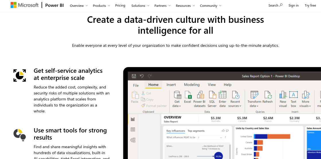
Microsoft Power BI is a data visualization application that allows users to combine data collection sources into one unified scalable platform for better business insights.
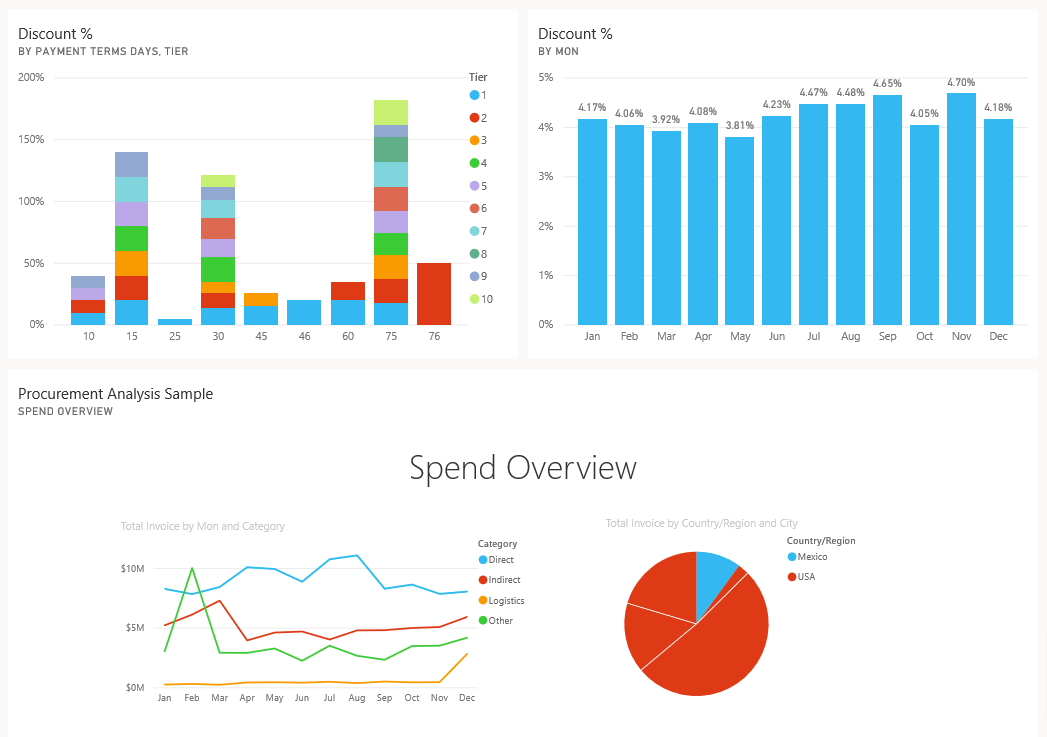
Microsoft BI allows users to connect all of their data sources to create actionable insights through its reporting features. AI powered technology helps provide answers to immediate business questions based on findings of your report. All data can be securely imported into the platform to allow for accurate analyzation. All data can be analyzed and collaborated on through sharing capabilities across different team members for more consistent decision making.
Microsoft Power BI is a chosen data visualization tool used across a variety of different industries such as healthcare, technology, manufacturing, retail, and more.
Pros:
- Data from different sources can be integrated seamlessly into the platform
- Advanced reporting features provide insights and answers to business questions using AI technology
- All data imported is secure and can be shared across multiple workflows
Cons:
- Microsoft users best benefit from use of the program, might not be optimal for other users
- Limitations in importing large quantities of data
- Can be complex to use
8. Infogram
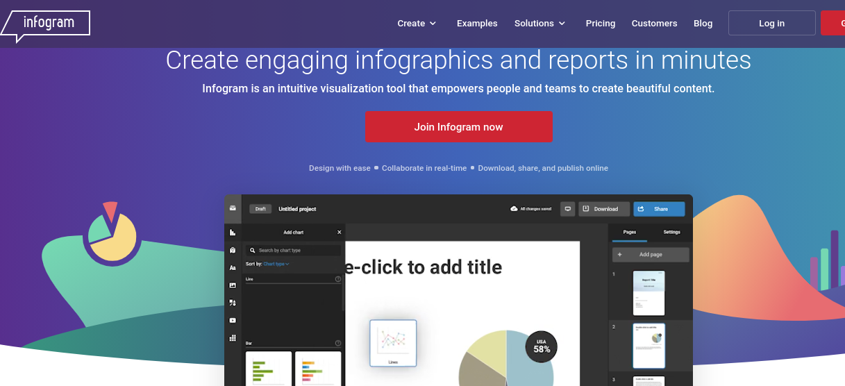
Infogram is an intuitive data visualization tool used for content development and identification of business opportunities. Infogram allows users to create visually appealing infographics and reports in just a few minutes. Infogram is often used by various professionals including marketers, executives, analysts, and more.
Infographic allows users to import data they have collected and transform it through visual representations, which can later be used for website content, marketing material, business meetings, and more. Infographic offers a variety of data visualization features, including the ability to create the following:
- Infographics
- Reports
- Slides
- Dashboards
- Posters
- Charts
Infogram allows users to create these various infographics that can easily be accessed and shared among team members. Infogram also offers an intuitive WYSIWYG editor which allows for shareability, publishing, and embedding into other existing business technologies.
Pros:
- Great for developing data-related visual content for marketing and branding purposes
- Multiple options for development of data infographics including reports, dashboards, charts, slides and more
- Content can easily be accessed and shared among team members on this cloud based program
- There is a free version of the program available to get started
Cons:
- Limitations on customization of designs
- Must be online to use the program (no option to download charts for offline use)
- Graphics can be somewhat static looking
Data Visualization Tool Comparison Chart
|
Name of Tool |
Includes Free Version |
Integrates with existing data collection Technology |
Creation of Charts, Maps and Tables |
Best Suited For |
|
Infogram |
yes |
yes |
yes |
Marketers, content creators |
|
Microsoft Power BI |
yes |
Yes- but functions best on Microsoft |
yes |
Executives, analysts, business owners |
|
Qlik Sense |
Free trial only |
yes |
yes |
Business owners, executives, analysts |
|
Looker |
Free trial only |
Yes- But requires adopting a new programming language (LookML) |
yes |
Business owners, executives, analysts |
|
Fusion Charts |
No |
Yes- but best suited for Javascript integrations |
yes |
Developers, Business owners, executives, analysts |
|
Google Charts |
Yes |
Yes- but best suited to Google Chrome users |
yes |
Business owners and analysts that don’t have a ton of experience in data visualization |
|
Data Wrapper |
yes |
Yes- but can be slow with large data imports |
yes |
Small-mid sized businesses, analysts |
|
Tableau |
Yes- but all data is public on the free version |
yes |
yes |
Developers, Business owners, executives, analysts |
Need help with data visualization?
Alliance is a full service digital design and development agency focused on your success. We can assist with new website integrations that provide insights on new business opportunities, as well as make updates to your website’s design to best engage your core audience. Whether you’re looking to build a brand new website or improve your marketing, get in touch and we’ll be happy to show you.
To get started with us, just give us a call at 888-222-9056 or contact us online today!