


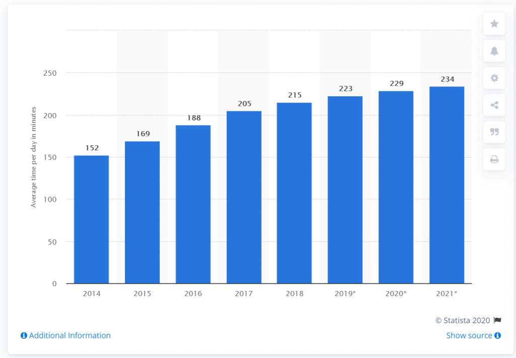
Having a website that is designed for mobile devices is extremely important – did you know over 52.2% of all website traffic is on mobile phones? According to Statista market reports, the time spent on a mobile device has increased to 3 hours, 10 minutes per day! Because of these changes in user behavior its essential to have a mobile website design that looks and functions great on any device.
What Does it Mean to be Mobile Ready?
Having a mobile ready website means that all of your website content, navigation, and imagery are easily accessible and display properly on a mobile device, which means they must organize and scale properly for a smaller viewing screen. All of the webpage links should also be legible and register properly when clicking on them.
Why is it Important to Have a Mobile First Website Design?
By having a website that is mobile-first and responsive across all devices, you won’t have to worry about frustrating mobile site visitors, or managing content on separate websites for a desktop and mobile version. Responsive design also ensures your website can be properly viewed across any portable device, including tablets and different sized smartphones. Google now takes responsive design into account as a factor for search engine optimization, giving mobile friendly websites a higher boost in their rankings.
The First Impression on Your Website Matters
As mobile website traffic continues to grow, the first impression of your website on a mobile device will impact how visitors interact with your website.
The statistics on mobile website design tell a very interesting story:
62 percent of companies increased their sales by designing responsive mobile platforms for their websites. (SAG IPL)
Increasing your website loading speed can prevent the loss of 7 percent of possible conversions. (infront webworks)
64 percent of total visitors want to see a company’s contact information on its homepage. (SAG IPL)
40 percent of people will switch to a different search result if the first one is not mobile-friendly. (SAG IPL)
What does a mobile website look like?
- A mobile first website will have the following:
Legible Font Size, - Vertical Navigation (often with more dropdown menu items than a desktop website and can usually be hidden if accessing other areas of the site),
- Clickable web page links, and
- Images that are within the viewport (not stretched or minimized).
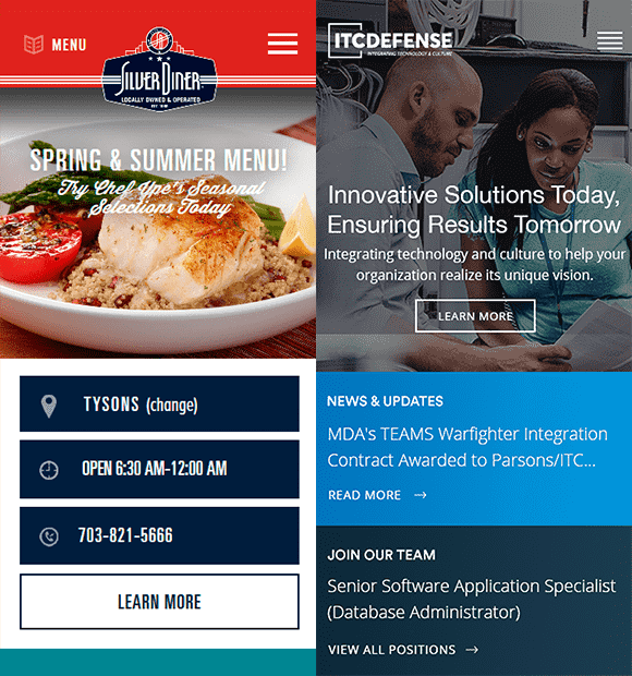
Here is an example of a mobile-friendly website design for the Silver Diner. Here you can see that the navigational menu at the top is collapsible. The images of the food are properly sized to fit within the mobile viewport, and the contact information and “Learn More” link are legible and can easily be clicked on without having to zoom in or out on the screen.
Here is another example of a mobile friendly website design. As you can see the branding and images are properly optimized for viewing on a smaller device, the font is legible, the links are large enough to click on, and the homepage navigation is updated so that it has less menu items, making the information easy to read.
How to Tell if Your Website is Not Optimized for a Mobile Device
Your website may not be optimized for a mobile device if any of the following apply:
- If you must stretch and scroll the screen in order to properly read content on your website, then the site is not optimized for mobile use.
- The homepage navigation menu bar also may be cut off on a smartphone, since a desktop website has a horizontal viewing area. This can be an issue for website visitors if they can’t access half of your website content, or.
- If links throughout the website are too small to read or click on with your finger, they also are not properly optimized for mobile use.
Examples of a Website Not Optimized for Mobile Use
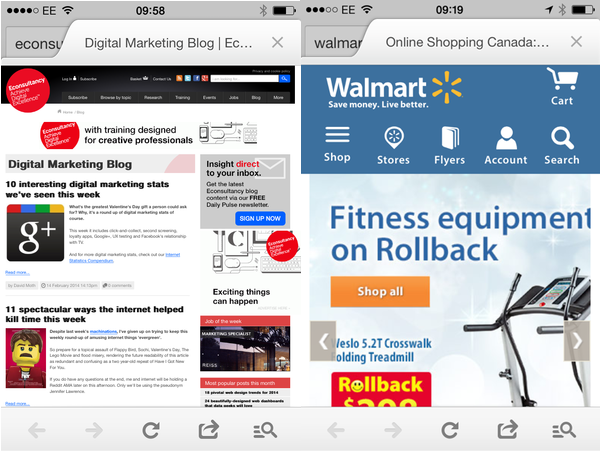
While the navigational menu is properly optimized for mobile use, here you can see the large image at the bottom of the workout equipment and promotional messaging below it is cut off and not fully in the viewport. In order to see this image, you would have to pinch and zoom in on it.
In this example, you can see that the website content and navigational menu bar is too small for viewing on a mobile device. Many of the website links would most likely not register properly and you would have to zoom in and out on the screen in order to read the content properly.
To test if your website is mobile friendly, check out this tool here.
How Investing in a Mobile Friendly Website Will Help Your Business
A mobile-friendly website can have the following positive benefits for your business:
- Increases search engine visibility
- Allows you to increase reach to new audiences
- Creates a consistent user experience across any device
- Increases sales and conversions
- Saves time on having to manage multiple websites and analytic data
- Gives you a competitive advantage over competition that is not mobile friendly
- Leads to more engagement with your business social media
- Increases your website’s performance
- Allows you to engage customers that would normally be offline
Alliance helps businesses create Mobile Website Designs that engage and attract new audiences on the go. To request a mobile audit or learn more about custom mobile design, contact us here.