


Understanding website dimensions is essential for creating an online presence that not only looks appealing but also functions seamlessly across a multitude of devices. This includes considerations from desktop monitors to mobile phones, ensuring a consistent and responsive experience for all users.
Responsive design isn’t just a trend; it’s a necessity in a world where users switch between their devices frequently without missing a beat. As such, web developers need to consider a variety of design elements, such as screen resolutions, aspect ratios, and adaptive elements, to enhance user experience. Furthermore, optimizing images and banners is vital for reducing load times, which can directly impact a site’s performance and its ranking in search engine results.
Our comprehensive guide dives into the complexities of standard website dimensions, offering insights into best practices and tools for testing responsiveness. From understanding common desktop resolutions to adapting mobile and tablet layouts, we cover it all. Additionally, we’ll explore techniques for optimizing performance and SEO, ensuring your website not only meets industry standards but stands out in a competitive landscape.
Understanding Website Dimensions
Understanding website dimensions is key to creating a seamless user experience. Let’s break it down:
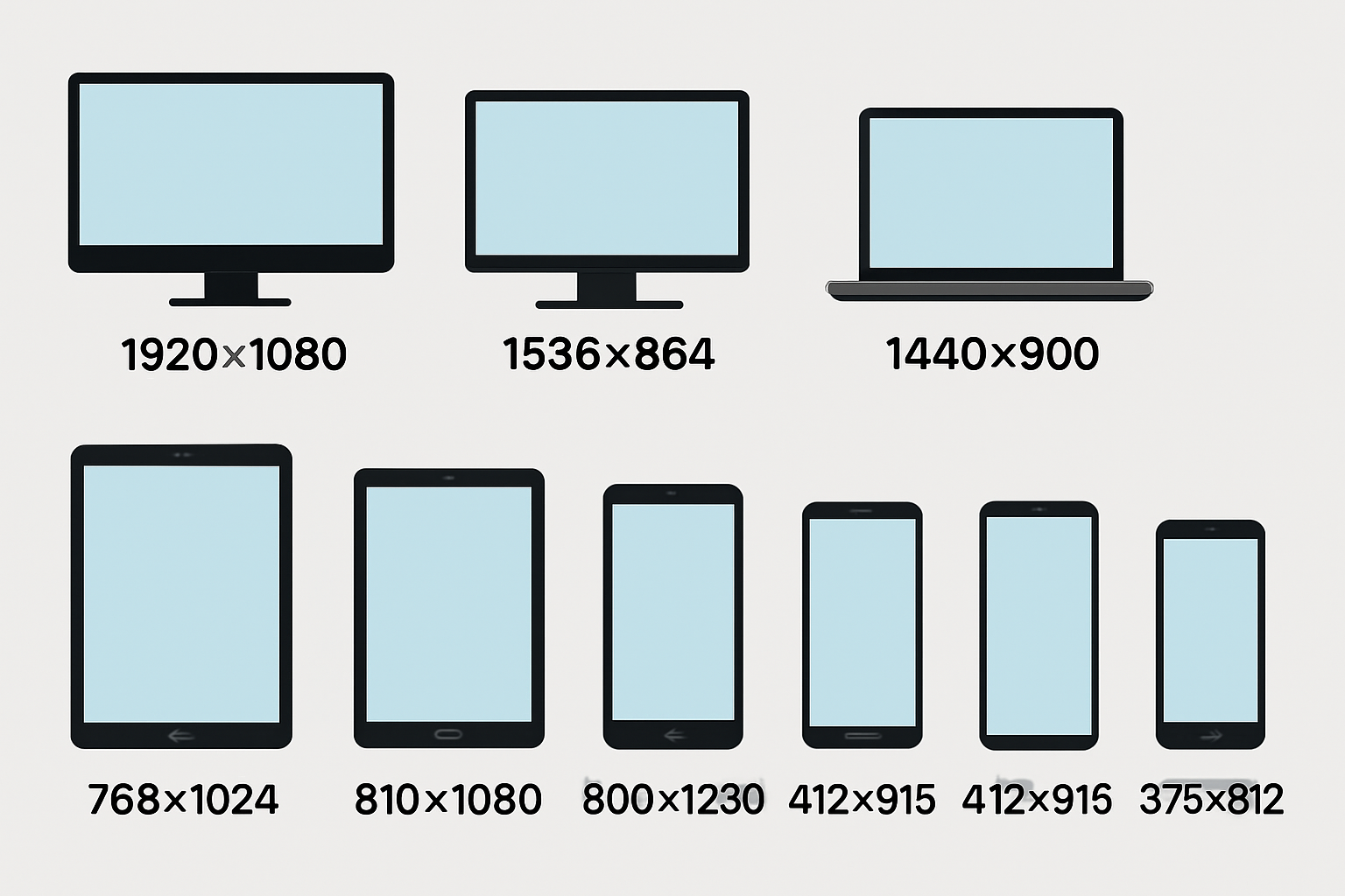
Desktop Devices
Design Considerations: Designing for desktop users involves accommodating a wide range of screen sizes and resolutions. Users typically expect content-rich experiences with ample screen real estate, so it’s important to prioritize multi-column layouts, large hero images, and detailed navigation. Ensuring that your website adapts well to various desktop resolutions enhances usability and accessibility.

Top 5 Desktop Screen Resolutions (Worldwide)
| Rank | Resolution | Market Share |
|---|---|---|
| 1 | 1920×1080 | 24.09% |
| 2 | 1536×864 | 10.79% |
| 3 | 1366×768 | 10.49% |
| 4 | 1280×720 | 5.38% |
| 5 | 1440×900 | 4.07% |
Mobile Phones
Design Considerations: Mobile design focuses on creating responsive, user-friendly interfaces that cater to smaller screens and touch interactions. Key considerations include simplifying navigation, optimizing load times, and ensuring readability without zooming. Given the diversity of mobile devices, it’s crucial to design layouts that adapt seamlessly to various screen sizes.

Top 5 Mobile Screen Resolutions (Worldwide)
| Rank | Resolution | Market Share |
|---|---|---|
| 1 | 360×800 | 10.25% |
| 2 | 390×844 | 6.55% |
| 3 | 393×873 | 5.35% |
| 4 | 412×915 | 4.33% |
| 5 | 375×812 | 4.23% |
Tablet Devices
Design Considerations: Tablets bridge the gap between desktops and smartphones, offering medium-sized screens that support both touch and, in some cases, keyboard input. Designing for tablets involves creating flexible layouts that adjust to both portrait and landscape orientations, ensuring that touch targets are appropriately sized and spaced.

Top 5 Tablet Screen Resolutions (Worldwide)
| Rank | Resolution | Market Share |
|---|---|---|
| 1 | 768×1024 | 16.6% |
| 2 | 810×1080 | 10.35% |
| 3 | 820×1180 | 8.08% |
| 4 | 800×1280 | 7.88% |
| 5 | 1280×800 | 7.05% |
Laptops (United States)
Design Considerations: Laptops, while similar to desktops, often have slightly smaller screens and are used in more varied environments, such as on-the-go or in limited spaces. Designing for laptops requires attention to scalability and readability, ensuring that content remains accessible without excessive scrolling or zooming.
Top 5 Laptop Screen Resolutions (United States)
| Rank | Resolution | Market Share |
|---|---|---|
| 1 | 1920×1080 | 21.52% |
| 2 | 1280×960 | 9.99% |
| 3 | 1366×768 | 7.28% |
| 4 | 1536×864 | 7.02% |
| 5 | 1280×720 | 4.78% |
Responsive design helps improve user experience and search engine rankings. Ensuring your site looks good on all devices, from the smallest mobile screens to the largest desktops, is the rule of thumb. Prioritize image quality and dimensions to enhance your website’s appeal to your target audience.
The Importance of Responsive Design
Responsive design is key to a seamless user experience across different devices. It ensures that a single website adapts well to all screen sizes, from mobile devices to larger screens, by using fluid layouts and flexible media queries. This approach also retains image quality regardless of the aspect ratio.
Benefits of Responsive Design:
- Higher Search Engine Rankings: Search engines favor mobile-friendly websites, boosting sites with responsive designs.
- Cost Efficiency: With responsive design, you only manage one site instead of multiple versions, cutting maintenance costs.
- Improved User Experience: It prevents distortion and ensures consistent image dimensions and quality across devices.
Given that over 51% of web traffic comes from mobile users, having a responsive website design is essential. It caters to the target audience and meets search engines’ criteria, enhancing search engine rankings.
To ensure the best results:
- Use Standard Dimensions: Aim for common screen resolutions.
- Maintain Image Quality: Keep an eye on image size and pixels wide for the best visual outcome.
Responsive layouts provide a seamless experience crucial in today’s digital age.
Key Considerations for Desktop Dimensions
When designing for desktops, understanding standard dimensions is vital. The maximum webpage width is often set at 1440 pixels to ensure compatibility with wide and super wide monitors. Within these dimensions, many opt for a main content area between 1140 to 1280 pixels. This ensures readability and usability on larger screens. For fixed-width layouts, a range from 960 to 1200 pixels is common. This balance caters to most screens and maintains ease of reading. For responsive designs, using container widths in percentages is crucial. Frameworks like Bootstrap help adjust layouts for different screens smoothly. A full-width layout of 1920 pixels or more often provides a broad canvas, accommodating diverse needs but requires careful design choices to ensure an optimal viewing experience without sacrificing readability or performance.
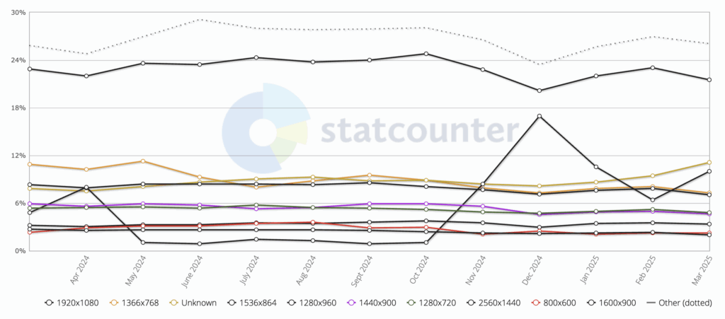
Common Screen Resolutions for Desktops
As of 2023, desktop screen resolutions have varied, with 1920×1080 leading the market. This resolution accounts for 22.18% of global screens, offering a full-HD experience. It is followed by 1366×768, which holds 14.02% of the share. The third most typical resolution is 1536×864 at 10.03%. Despite the prevalence of 1920×1080, several other resolutions are in use, varying by region and device types. Historically, the move from a 1024-pixel standard webpage width reflects the rise of larger monitors. The trend highlights how technological advancements dictate design dimensions. When targeting a broad audience, accounting for these common resolutions helps ensure that your website accommodates the majority of users seamlessly.
Selecting Appropriate Aspect Ratios
Aspect ratios play a crucial role in web design, impacting how media is displayed across devices. Common ratios like 16:9 are ideal for wide-screen media, while 4:3 suits traditional content. These ratios ensure images and videos appear correctly on different screens. Selecting the right aspect ratio is essential for responsive design, allowing elements to resize gracefully for various screen sizes. Common ratios include 1:1 for square visuals and 4:3 for classic landscapes. A 4:5 ratio can optimize mobile views, balancing appeal and functionality. The choice of ratio significantly affects how content is perceived. A well-chosen aspect ratio ensures that media fits seamlessly within a website’s overall design. For desktop displays, 16:9 is often preferred, offering a balanced widescreen view. Meanwhile, a 4:5 ratio can enhance mobile compatibility, ensuring media content looks great everywhere. This thoughtful integration of aspect ratios into responsive design strategies leads to a cohesive and visually appealing site.
Mobile and Tablet Dimensions
Understanding standard dimensions for mobile and tablet screens is key to designing effective websites. Mobile devices often have varying screen sizes, but some standard resolutions are more prevalent. For instance, the most common mobile webpage width is 360 pixels, seen in resolutions like 360 x 800 pixels. This format captures a share of around 11% of devices. A close second is the 390 x 833 pixel resolution, utilized by about 7% of users. Tablets have their norms, too. A significant portion, 23% of tablets, use the standard size of 768 x 1024 pixels. Another 10% opt for 810 x 1080 pixels. Responsive web design is essential to provide a seamless experience across these diverse screen sizes, ensuring sites adapt automatically without user adjustments like scrolling or pinching.
Adapting to Mobile Screens
Adapting to mobile screens involves more than just fitting content into a small space. While the common viewport dimension for phones is 360×800 pixels, flexible designs help cater to various screen resolutions. Mobile-first design is key, focusing on creating smooth user experiences. This approach considers screen widths from 320 pixels for the smallest phones to 414 pixels for larger ones. Moreover, image files should be optimized for size. Keeping product photos around 300 KB helps prevent slow load times, which can be crucial as large images might impede mobile performance. Text should also be accessible. For screens narrower than 360 pixels, adjusting font sizes ensures readability. By using responsive layouts and image resizing tools, websites can maintain quick load times while providing quality experiences.
Considerations for Tablet Layouts
Creating effective tablet layouts requires careful thought to enhance user interaction. The standard size for many tablets is 768 x 1024 pixels, while another 10% of users prefer 810 x 1080 pixels. Responsive design is vital, allowing websites to fluidly transition between portrait and landscape modes. This adaptability promotes readability and interaction, improving the user experience by removing the need for horizontal scrolling or pinching. For tablet designs, this means crafting interfaces that fit seamlessly across these orientations. When developing for tablets, pay attention to popular resolutions to ensure consistent display and functionality. Such considerations help guarantee that the site looks good and works well on various devices, offering a seamless experience for the target audience.
Best Practices for Images and Banners
When designing websites, using the right image sizes and banners is crucial. This helps to create a seamless user experience while ensuring the site loads quickly. Modern formats like WebP and AVIF are preferred because they maintain image quality even with compression. Hero images look great at 800px by 1200px on mobile devices. A good content management system will resize images to fit various screen sizes, enhancing the site’s appeal across platforms. Banners, like square ones at 250px by 250px, should focus on maintaining a 1:1 aspect ratio and crucial details in the center. This design tactic prevents issues on mobile screens. Lastly, keep image files around 150 KB to boost performance and speed. By adhering to these best practices, your site can remain both visually appealing and efficient.
Optimal Image Sizes for Fast Loading
To maintain quick loading times, background images should be at least 1920 pixels wide. Compressing these images will reduce their file size, making your site faster. Thumbnails and icons should fall between the 100 x 100 to 300 x 300 pixel range. This ensures they load quickly but are still clear to users. Using responsive image techniques, like resizing images for different devices, enhances both loading times and the user experience. Keeping image sizes below 2 MB is advisable, as files larger than 20 MB can slow down your site. Lazy loading scripts can also be used to prioritize crucial images, improving load times significantly. These strategies ensure your website remains fast and efficient without sacrificing quality.
Banner Dimensions for Different Devices
Mobile devices require banners with specific dimensions for effective display. Standard webpage dimensions for a landing page banner on mobile are around 320 pixels wide, while background images might extend to up to 393 pixels. On desktops and larger screens, Google’s top display ad sizes like the 728×90 pixel Leaderboard and 336×280 pixel Large Rectangle are commonly used. When designing these banners, ensure they don’t exceed 150 KB to meet platform requirements like Google’s. For desktops, keeping images around 1920 to 2000 pixels wide ensures optimal loading and clarity. Responsive web design also suggests using dimensions like 360×800 pixels for mobile phones and 1440 pixels for desktops. Tablets typically use 768×1024 pixels to accommodate common screen resolutions. Following these guidelines will enhance search engine rankings and offer your target audience a seamless experience.
Enhancing User Experience with Adaptive Elements
Responsive design is key to enhancing user experience on the web. It ensures websites look great and function well across all devices—desktops, tablets, and mobile phones. By adapting content and design, users get a consistent experience no matter which device they use.
- Compatibility: A responsive layout adapts to various screen sizes, allowing easy navigation.
- Improved Engagement: By offering a seamless experience, users stay engaged longer.
- Search Engine Benefits: Responsive design can boost search engine rankings.
- Cost Efficiency: It reduces maintenance costs by eliminating the need for separate mobile and desktop sites.
Benefits of Responsive Design:
|
Feature |
Benefit |
|---|---|
|
Consistent Design |
Fluid page adjustment across devices |
|
Optimized Navigation |
Improved user interaction on various screen resolutions |
|
Maintained Image Quality |
Quality images across different aspect ratios |
|
Streamlined Transition |
Smooth device transition without disrupting the experience |
Responsive design principles ensure a seamless and engaging user journey, helping create a positive brand impression. Adapting to the screen’s dimensions provides an optimal viewing experience, making websites more accessible and enjoyable for everyone.
Performance and SEO Optimization
Responsive web design is vital for optimizing both performance and search engine rankings. By ensuring websites adapt to any device, web developers can maintain consistency and efficiency. Since Google’s 2010 “Mobile-Friendly” algorithm update, the importance of responsive design for SEO has only grown. It simplifies coding because changes are made once instead of across multiple separate versions. Moreover, optimizing images through compression reduces page load times, enhancing user experience and SEO. Image optimization involves not only resizing but also using ALT tags and unique dimensions. This approach ensures a unified user experience, helping websites achieve solid search engine rankings and improve visibility.
Techniques for Faster Load Times
Faster load times are key to a positive user experience and better search rankings. Using modern image formats like WebP and AVIF can compress image sizes significantly, sometimes more than 30% compared to older formats like JPEG and PNG. This reduces load times without affecting quality. Compressing images before uploading them can also be beneficial. Additionally, the HTML srcset attribute enables serving different image sizes to various devices, ensuring that mobile users don’t download unnecessarily large files.
Website performance isn’t solely about image sizes. It’s crucial to consider overall content size and to implement responsive design strategies. Techniques like caching and minimizing render-blocking elements contribute to faster load times. Optimizing scripts and images speeds up page loading, offering a smoother experience for users. Together, these strategies reduce frustrations and improve search engine optimization by presenting pages that meet the needs and expectations of all types of users.
Improving SEO Through Responsive Design
Responsive web design plays a critical role in improving SEO. By enhancing the mobile search experience, it can significantly boost search engine rankings. A single responsive site streamlines SEO efforts across various devices, increasing overall visibility. Search engines, including Google, favor mobile-friendly websites, which responsive design guarantees, thus improving search visibility.
Simplifying technical and coding requirements, responsive design facilitates seamless website management, promoting sustained SEO performance. It contributes to smoother navigation and an enhanced user experience, allowing websites to rank higher in search results. Ultimately, a responsive design ensures that users—from desktop to mobile—experience seamless navigation. This dedication to improved user experience is recognized by search engines, rewarding sites with better rankings and visibility.
Tools and Techniques for Testing Responsive Designs
Testing responsive designs is crucial for delivering a seamless user experience across devices. One effective tool is the BrowserStack Responsive Design Checker. It lets you test websites on over 3,500 real Android and iOS devices. This ensures accurate testing across various screen sizes and operating systems.
Key Features:
- Resolution Selection: Instantly switch between different screen resolutions to check how your site adapts to mobile screens and larger screens alike.
- Font Magnification Checks: Ensure text scales up to 200% without breaking your layout. This enhances accessibility for users with visual impairments.
BrowserStack supports both manual and automated testing. This helps you identify inconsistencies across real browsers and devices. Such testing is vital for responsive web design. It helps improve user experience and can boost search engine rankings.
Using these tools, you can ensure your website’s dimensions and image sizes fit common screen resolutions. This approach helps maintain image quality and proper white space, improving overall user experience.
Staying Updated with Industry Trends
Staying updated with industry trends is vital for crafting effective marketing campaigns and web design strategies. Awareness of best practices and insider tips can help ensure websites remain relevant. This relevance is key to achieving a high conversion rate.
Regularly reviewing screen resolution data is one way to make informed choices about standard website dimensions. This helps ensure that designs cater to most user devices. Here are a few steps to stay informed:
- Subscribe to Newsletters: Get the latest insights on digital advancements.
- Engage with Industry Research: Tools like StatCounter provide valuable data on device usage.
- Follow Best Practices: Keeping abreast of dynamic changes ensures a responsive web design suitable for diverse screen sizes.
Understanding standard dimensions and screen resolutions is essential. Consider these common mobile screen resolutions:
|
Screen Size |
Resolution (pixels) |
|---|---|
|
Small |
360 x 640 |
|
Medium |
375 x 667 |
|
Large |
412 x 915 |
These practices ensure a seamless user experience, catering to the needs of mobile users and larger screens alike.
Analyzing Audience Device Preferences
Understanding your target audience’s device preferences is crucial for effective web design. Tools like StatCounter can show the most popular screen sizes, helping you tailor your site’s layout accordingly. Common resolutions include 375×667 for mobiles, 768×1024 for tablets, and 1920×1080 for desktops.
Here’s a quick guide:
|
Device Type |
Common Dimensions |
|---|---|
|
Mobile |
375×667 |
|
Tablet |
768×1024 |
|
Desktop |
1920×1080 |
Designing for different screen sizes ensures a seamless experience, enhancing user satisfaction and search engine rankings. Consider mobile banners in sizes like 300×50, 320×100, and 320×50, especially for younger audiences who prefer smartphones.
Understanding breakpoints is also key. Categories include:
- Small: < 640px
- Medium: 641px to 1007px
- Large: 1008px and larger
By optimizing for these dimensions, you ensure your site looks great across devices, from compact mobile screens to larger desktops. This approach supports a responsive design and improves user engagement.